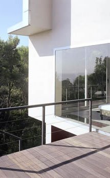
Construction has begun on a 20-story residential tower on 5 Franklin Place in New York designed by Dutch architect Ben van Berkel of UNStudio.
The exterior will be wrapped in black metal bands which will form balconies, terraces and sunshades. These bands will also frame views from inside the apartments and provide privacy for inhabitants.
The building will contain 55 apartments ranging in size from approximately 1,200 square feet to approximately 3,400 square feet. There will be three types of home: the loft residences on the lower floors, city residences above and three sky penthouses. Fixtures for kitchens and bathrooms have been designed by van Berkel and manufactured by B&B Italia.
The building is UNStudio’s first major project in America.
All renderings by Archpartners.
Here’s some information from UNStudio, followed by an interview between Raul Barreneche and Ben van Berkel:
–
In 1998, Dutch architect Ben van Berkel, co-founder of UNStudio, Amsterdam, captured the imaginations of design cognoscenti around the world with the Möbius House, a remarkable private residence in Het Gooi, the Netherlands. Nestled on a sylvan site northeast of Amsterdam, the Möbius House gave physical expression to the fluctuating domesticity of modern life in an endlessly looping form of concrete and glass, containing luminous interiors where interlocking private and public areas defied all previous convention. With the Möbius House, van Berkel illustrated his belief that things evolve and change – both architecture and family life are elastic – and that orthodoxies exist to be challenged, including the increasingly stale tropes of glass-sheathed, square box Modernism.
Featured in the landmark 1999 exhibition The Un-Private House at The Museum of Modern Art in New York City, the Möbius House was soon followed by a spate of ever more daring museums, university buildings, corporate structures, residences and industrial design projects that established Ben van Berkel as one of the most significant and critically acclaimed architects of his generation – a designer who embodies what mid-century Italian architect Ernesto Rogers exalted as “designing from the spoon to the city,” connecting public and private worlds.
In conjunction with the 10th anniversary of the completion of the Möbius House, construction has begun in New York City on Ben van Berkel’s latest, most ambitious and beautiful re-interpretation of standard domestic architecture: Five Franklin Place, UNStudio’s first major American project, will be a 20-story residential tower on Franklin Place, an original 19th century cobbled passageway that runs parallel to Broadway and connects Franklin and White Streets in the Tribeca historic district of Downtown Manhattan. The building will be wrapped in an optically dazzling, constantly shifting pattern of horizontal black metal bands sewn onto its form the way decorative seams and pleats are sewn onto a luxurious couture garment. A direct homage to the applied metal façade decoration of Tribeca’s celebrated 19th century cast iron architecture, these gleaming reflective ribbons will grow thinner and thicker, wrapping the entire tower and moving softly around corners to give the whole structure an etched effect and curvilinear softness, while reflecting the evolving light of day, the clouds and the colours of the city in one of the most dramatic compositions attempted in modern Manhattan’s recent building boom.
Van Berkel’s highly decorative architectural garment is no mere graphic conceit: Thanks to strategic twisting and torquing, his facade bands will serve as essential functional elements of the tower as well, transforming into balconies for more than half of the building’s residences, terraces for the penthouses at the top, and sunshades that deflect heat and protect all of the structure’s interiors from excess sunlight. These iconic metal bands will serve to also frame panoramic views from inside the building’s residences and insure a level of intimacy and privacy at Five Franklin Place that would be impossible to achieve in a transparent glass facade building.
Sketches by Ben van Berkel, Courtesy UNStudio, Amsterdam
Equally important, the exterior geometries of Five Franklin Place will relate directly to the building’s interiors, which will balance high glamour and cutting edge technology with a distinct atmosphere of warmth. The horizontal and mutable qualities of van Berkel’s facade bands have been brought inside and translated into broad horizontal spatial arrangements; carefully placed curved walls that echo the soft corners of the ribbons outside and shift to allow for maximum flexibility in the use of rooms; balconies shaped to loop residents’ movements back indoors; and highly-engineered, custom features and fixtures for kitchens and bathrooms designed by van Berkel and fabricated by renowned design manufacturer B&B Italia, to echo the shapes formed by the elegant facade treatment. Every interior element has been conceived to maximize light and the exceptional views – bathrooms for example, will have circular sliding doors so that baths can become part of bedrooms and share the same views – and to introduce an alternative to the now standardized rectilinear interiors of contemporary condominium architecture in New York City.
Containing 55 residences in three distinct zones, Five Franklin Place will stand on the frontier of the Tribeca historic district, which is today considered one of the world’s most coveted addresses, in close proximity to such dynamic and desired neighborhoods as Soho, the West Village, the Financial District, Chinatown, and the bustling Lower East Side.
The homes within Five Franklin Place will range in size from approximately 1,200 square feet to approximately 3,400 square feet, and will include one-, two-, three- and four-bedroom apartments configured as duplex lofts or single-level homes, as well as three soaring duplex penthouses with interior elevators and rooftop terraces. Prices for the properties at Five Franklin Place will range from $2 million to $16 million.
Five Franklin Place has been developed by David Kislin and Leo Tsimmer, principals of Sleepy Hudson LLC, which in 2007 completed construction of the elegant High Line 519 in West Chelsea. General contractor for the Five Franklin Place is Leeds United Construction LLC. Exclusive sales and marketing agent for the project is Corcoran Sunshine Marketing Group.
Following images: loft residences
“It seems fitting that Ben van Berkel’s first major American building will be completed at the moment when New York City celebrates the 400th anniversary of the original Dutch settlement of Manhattan,” commented the partners of Sleepy Hudson. “Ben has a pioneering, daring spirit, a global vision that we share. With Five Franklin Place, our entire team aspires to celebrate the art of building, to translate Ben’s vision into a perfect local expression, and to prove that the sublime and the practical can exist side by side in a perfect place to live.”
The Building: Loft Residences, City Residences, Sky Penthouses Residents of Five Franklin Place will enter the building on Franklin Place, a narrow, cobbled north-south lane once known as Sugar Loaf Alley, the heart of New York City’s 19th century sugar trade. Newly restored with period lighting, cleaned and re-pointed pavers, and lush vertical plantings, this historic passageway will offer an atmosphere evocative of Old New York and Tribeca’s great past. Beyond a pair of silent, electronically controlled sliding doors and a climate controlled vestibule, the lobby of Five Franklin Place – overseen by a 24-hour doorman and an attendant offering valet parking service – will unfold as a distinctly sculptural but serene, softly lit environment of curving white lacquer fixtures, including built-in leather seating areas and a sparkling violet glass-chip floor. A sweeping curved stairwell will lead from the lobby to a sub-grade level private spa and fitness center. Custom designed by UNStudio and engineered by B&B Italia, this area offers residents a daylight flooded double-height weight room, a wet spa with mosaic tiled steam pavilion and sauna, and a mirrored multi-purpose room for yoga, pilates and stretching, all with towel and water service.
In discussing UNStudio’s priorities for Five Franklin Place, Ben van Berkel recently explained, “The building sits at the edge of the Tribeca Historic District, so that low lying structures fan out beneath it to the west and create amazing vistas. At the same time, the site sits squarely between two existing buildings, with the challenges this implies in an urban setting. Exploiting the light and views to the maximum extent was our priority. We started with the purpose and the program of any building: How will the users experience it, what will it be like to live and work and play inside?”
Van Berkel and UNStudio answered these questions by conceiving Five Franklin Place as a tower in three portions. For each zone, the architects chose different color schemes and material palettes related to the amount of natural light that can be accessed in apartments at various levels of the building, attempting to work with that natural light and complement it, but not necessarily in expected ways.
According to the architect, “On the lower floors where there is a need to maximize daylight, we have specified the lightest-coloured floors and fixtures and wall colors throughout. On middle floors where there is more daylight because the residences are above adjacent buildings, we have a more cream-colored palette, softer because there is more natural light and less need to push for its reflection into the homes. And on the top levels of the building, where there is very abundant light, we have used richer, deeper colors and finishes in a very luxe way.”
Following images: city residences
The lower part of Five Franklin Place is framed between neighboring buildings on two sides, north and south. On these floors – floors 2 through 7 – van Berkel created Loft Residences with 20’ double height living rooms and floating upper level mezzanines configured to bring daylight deep into the apartments. Whereas New York loft mezzanines are typically fixed at one end of an apartment, generating a tunnel effect that leaves a portion of the home very dark, UNStudio made a seemingly simple but radical move by shifting the mezzanines of the Loft Residences to the centre of the floor plan.
Each Loft Residence at Five Franklin place also enjoys a large vault with a soaring integral wall that turns from the kitchen into a library. The palette of finishes in these homes is pale, light and reflective, all to boost illumination into the entire home, including the large bathrooms and bedrooms as well as common spaces.
The City Residences on the middle floors of Five Franklin Place – floors 8 through 18 – are characterized by 270 degree views and generous floor plans with expansive paved terraces on the east and west sides of the building. Inspired by the gracious entry foyers of New York’s great pre-War apartments, van Berkel worked to create an equally graceful 21st century interpretation: In every City Residence a custom wall panel frames the lacquered gallery foyer, creating a special space for art, and rooms unfold to flow into one another. As with the rest of the building, fixtures and finishes in this zone were developed with eye toward luxury and comfort, with baths sporting sliding glass tambour doors so that residents can adjust levels of privacy to be completely alone or to open their bathing space to views in rooms beyond.
The three Sky Penthouses at the top of Five Franklin Place have spectacular panoramic views of the Manhattan’s West Side to the Hudson River. Veritable houses in the sky, these homes are graced with an interior, cylindrical glass elevator wrapped by a curved, cantilevered floating staircase; operating fireplaces; master baths with panoramic views; and expansive ipe wood and travertine slab terraces with outdoor Sky Spas and entertaining areas.
Throughout all three zones of Five Franklin Place, residents will enjoy generously proportioned environments with meticulously conceived technological elements that bring the convenience of an iPod into the broader home experience. Key details range from computerized light level controls to carefully conceived adjustable windows and doors.
Following images: sky penthouses

The B&B Italia Collaboration
Throughout Five Franklin Place, kitchens, baths, cabinetry and woodworking designed by Ben van Berkel and UNStudio will exhibit a level of innovation and master craftsmanship rarely seen in New York City condominium developments. This degree of excellence has been guaranteed by an intensive collaboration between the architects and the Contract Division of B&B Italia, one of Europe’s most admired design manufacturers.
Sleepy Hudson brought B&B to the Five Franklin Place project to ensure the highest level of engineering expertise in achieving very precise and challenging original designs conceived exclusively for the building by its architect. Among these are bathrooms that qualify as text book studies in luxury customization, with continuous, built-in curvilinear components and sliding circular doors that allow residents to adjust levels of privacy on different occasions; custom closet systems with integrated drawers and partitioned hanging areas; fitness area features that include luxurious and somewhat avant garde interpretations of standard gym and spa components; and kitchens that, in the words of van Berkel, “don’t really look like kitchens,” with dynamic, thermoformed Corian and metal islands with flying fireplaces; master baths with panoramic views; and expansive ipe wood and travertine slab terraces with outdoor Sky Spas and entertaining areas.
Summarizing his firm’s approach to the residences at Five Franklin Place, Ben van Berkel commented, “Tribeca is a wonderful place with a fascinating history – an amazing architectural history, but also an interesting history of how artists have worked and lived in the district’s buildings. In our view, those artists defined the neighborhood’s lifestyle, the casual way that people occupy the lofts there, interpreting the spaces in unusual ways. Thinking about this, we wanted to create homes with some of that same casualness and flexibility. We did not want to over-define the rooms, because people today want to live with a sense of freedom and define these things for themselves even in the most luxurious homes. Our job was to bring the views indoors, to make a place that is truly embracing and comforting and pleasurable, and perhaps also to expand the definition of how we live at home.”
The sales and design centre for Five Franklin Place is located at 7 Harrison Street, at the corner of Staple Street between Greenwich and Hudson Streets in Tribeca.
–
In the spirit of great architecture, Raul Barreneche sat down with Ben van Berkel to present and discuss the design and origins of Five Franklin Place.
raul barreneche: You have said that one of the greatest influences on your design for Five Franklin Place is the historic architecture of TriBeCa. Can you elaborate upon that?
ben van berkel: Absolutely. We picked up the strong horizontal cornices and decorative details of TriBeCa’s castiron architecture, re-formed them, and transported them onto our building in a very contemporary way that makes them truly functional but that still has a lot to do with pure surface decoration. The reflective metal bands of our building are almost sewn on, like a dress. They grow thinner and thicker, wrapping themselves around the building and generating different visual effects as they change. But they are not just graphic elements, they are three-dimensional. Sometimes these bands become balconies; other times they become sunscreens that protect the apartment interiors from excess sunlight and reflect excess heat. So they have a true function and a sustainable quality, too. These metal ribbons not only pick up the external qualities of TriBeCa through their geometries and their character as added metal elements on the surface of the structure, but they also frame the views from inside the apartments and create intimacy. We couldn’t have achieved the privacy and intimacy of the homes at Five Franklin Place if we’d made ours a fully transparent glass facade building.
rb: What about the fluid geometry of the exterior?
bvb: There are definitely strong curvilinear qualities in the design. The corners of the building are soft, almost etched. I can imagine sitting in one of those corners of the apartment, drinking coffee and reading the paper in the morning light — and it would be like sitting right in the middle of the city. We think it’s very important to bring things together coherently and inclusively, to create a formal resonance with the details of the design. Sometimes a curving line on the facade is echoed inside the apartment in the form of a curved wall. So there’s integration between the geometry of the facade and the geometry of the interiors.
rb: In one of your books you wrote, “The box is dead,” suggesting that you’re not a fan of traditional rectilinear buildings.
bvb: I’m not saying you can’t work with regular, grid-like organizations. It’s not so important to think of architecture with stylistic references. Who cares if something is a box or a blob? I very much like the idea of transformative architecture. This building is about moving away from a harder system — the grid — to a softer kind of architecture. That’s transformative. But it’s not invasive or gratuitous.
rb: Is that a result of having studied with Zaha Hadid?
bvb: Being a student of Zaha’s at the Architectural Association in London was very important for me. She was quite good at teaching us to draw big. I had tended to sketch on little pieces of paper before that, but we had to work on 10-foot long sheets — otherwise you weren’t allowed in the classroom. When I arrived there, I had already studied architecture, interior architecture and graphic design for four years. Zaha thought I should start in the third year, but the head of the school, Alvin Boyarski, said, “You have to start all over. You know too much. You have to forget everything you have learned.” I liked that. In fact, I still use that as a slogan for my way of thinking. In the studio, I don’t like when we get too fixed on a particular paradigm, or we’re only following one direction. Often we rethink things and start all over with a new idea.
rb: Speaking of new ideas, what about the unusual color of the facade at Five Franklin Place? There aren’t many black buildings in New York, though two very elegant mid-century landmarks — Mies van der Rohe’s Seagram Building on Park Avenue and Eero Saarinen’s CBS headquarters on Sixth Avenue — are famously black.
bvb: Black is not a color we think of very often when it comes to buildings, but it’s a very accepted color in fashion and industrial design. So while the bands are indeed black, the black captures the colors and reflects the environment and weather around the building, bringing light and color to animate the facade. Think of the incredible work of the fashion designer Issey Miyake, who plays with texture, volume and the reflection of light. And he does this exquisitely with black garments. His is work like architecture, in fact it has been exhibited in major museums as a kind of architectural achievement. In a way, we have borrowed certain ideas from people like Miyake and others in different design disciplines, making a textural facade that sometimes picks up light and reflects it, and sometimes absorbs light. So black contains many things and at Five Franklin Place it
is extremely elegant but also very dynamic.
rb: You’ve written about the connections between architecture and fashion design. How do you see the two disciplines informing each other?
bvb: It’s fascinating. On the one hand, fashion is something that moves quickly. But at the same time — and for that very reason — it usually generates much better ideas than architecture. I think architects are slow to come up with new design techniques. I often refer to fashion because I think that architects “dress” the city, in a manner of speaking. And buildings are in some ways like bodies with their complicated structures and functions; they need to have skins, be dressed. Why not explore new building techniques or design concepts, like pleated or textured facades? I’m not suggesting that architects should become fashion designers, but we can rethink architecture.
rb: You haven’t designed any clothing, but you have created serving trays and a tea service for Alessi, as well as seating for Walter Knoll in Germany. Are there common threads between these various design disciplines?
bvb: We very much like working on smaller-scale projects, industrial design projects, and things of that nature. We’ve learned a lot working in industrial design over the past few years. What I find interesting about such projects is that you get to experiment with a certain material, like sterling silver, that you are not using in buildings. When I designed a coffee and tea service for Alessi in silver, I discovered that you could create far more complex forms than I ever expected. Product design gives you ideas that you might expand on later at a bigger scale — like buildings, for instance.
rb: What were some of your priorities when you started designing Five Franklin Place?
bvb: Exploiting light and views was an essential part of the overall architectural design concept and a guiding design principle for us. We start first with the purpose and the program of any building: how will the users experience it, what will it be like to live and work inside? At Five Franklin Place, the lower part of the building is framed between the walls of adjacent structures on two sides, north and south. So on these lower floors we created what we call double-height Loft Residences with floating upper level mezzanines and large openings so that daylight can be filtered deep into these apartments. In fact, we decided to change the traditional way mezzanines are fixed at one end of an apartment — this often creates a sort of tunnel effect that leaves some part of the space very dark — and instead placed the mezzanines of the Lofts toward the center of the unit. This was a key move in the design process to optimize daylight throughout the entire home, and we’re very excited about this solution.
There are nice big vaults in the Lofts, a wonderful integral wall that turns from the kitchen into the library, and big bedrooms and bathrooms. The City Residences on the middle floors of the building have beautiful views and a generous floor plan. We studied the entries of New York’s great pre war apartments to create a graceful experience in each residence, with custom wall panel details that frame gallery foyers. And many of the City Residences have terraces, east and west.
The Sky Penthouses at the top of the building have spectacular panoramas over the West Side of Manhattan, all the way to the river, by virtue of the height of the building at that level, rising above the buildings around it. The Sky Penthouses have big terraces and an internal elevator and stair. These residences have all the features one associates with a penthouse.
rb: Are there other distinctions among the different types of apartments you designed?
bvb: We chose different colors and materials related to the amount of natural light that can be accessed in apartments at the various levels of the building. Our idea was to work with the natural light and complement it, but not necessarily in expected ways. So on the lower floors of the building where there is a need to maximize daylight, we have specified the lightest-colored floors and fixtures and wall colors throughout — finishes that boost the natural light farther into the spaces. On the middle floors, we have a more cream-colored palette, softer because there is more natural light and less need to push for its reflection into the homes there. And on the top levels of the building, where there is very abundant light, we have richer, deeper colors and finishes.
rb: How did the building’s location in the heart of TriBeCa shape your design?
bvb: TriBeCa is a wonderful place with incredible history — amazing architectural history, but also an interesting history in how art and artists have worked and lived in the buildings there. To us, artists defined the lifestyle of the neighborhood. One aspect of this is the casual way that people have occupied the lofts you typically find in TriBeCa. Thinking about those, we wanted to create some of the same casualness and flexibility — we didn’t want to overdefine the spaces in our apartments — because people today want to live with a sense of freedom and define the home spatially for themselves. We live so differently now then we did ten or twenty years ago. Contemporary lifestyles seek out new forms of flexibility.
rb: Does this mean open kitchens?
bvb: Yes. The kitchen island has become much more than just part of the kitchen: It’s a crossing point between different spaces in the home. People love to socialize in the kitchen; families like to gather around the kitchen island to talk when someone is cooking. So we see the kitchens at Five Franklin Place more as areas that connect different spaces of the home and provide a kind of pivot point. Also, I like it when a kitchen doesn’t really look like a kitchen, but more like a composition of furniture with a beautiful product as part of that composition — like an iPod. So we have given special focus to the kitchen islands at Five Franklin Place, giving them a unique sculptural quality that we think brings something special to the homes in the building. We designed these specifically for the building and are working closely with B&B Italia to custom-construct these pieces. It’s very exciting.
rb: What kind of technology do the apartments at Five Franklin Place utilize?
bvb: The computer played a very important role in the design and the manufacturing of the facade. The façade ribbons twist into each other; they become the floor of a balcony and then turn into a handrail, and then become part of the facade itself. The technology for how we designed all of that is quite advanced. Inside the apartments themselves we thought about very advanced details, from how you switch on the lights to the way the glass wraps around the bathroom and how the windows open. There are many things we are making as advanced as possible and those elements are technologydriven.
rb: Many of the houses you’ve designed, including the Möbius House in the Netherlands, featured at the “Un-Private House” exhibition at MoMA, and the VilLA NM here in the United States, tend to have long, horizontal profiles. How do such houses compare with the kind of vertical New York living you have designed for Five Franklin Place?
bvb: The apartments at Five Franklin Place do not follow a strong grid. They are organically designed in how the stairs swoop upward, how the balcony loops you back indoors. There’s an idea of looping around the apartments, without many dead ends, so that all of the space really accommodates life and the flow of life. In these urban residences, the bathroom becomes part of the bedroom and both share the same view. That kind of transformative living is something we thought a lot about and it is something that vertical living invites and even needs.
rb: What qualities of New York does the building reflect?
bvb: Manhattan is a very robust, urban place with an all-important grid. But it also has charming, almost European qualities. You find this combination in TriBeCa especially. What we wanted to pick up in the design was a very robust building — in a modern sense — that also had a little bit of delicateness and intimacy. In the bends and frames of the facade of Five Franklin Place, we played with deforming the idea of the grid that is so potent outside, but we also respected the context and made a building that complements that context.
rb: What do you hope this building offers, not just to the people who will eventually call it home, but to the urban landscape of New York?
bvb: Hopefully, Five Franklin Place is a building that communicates a contemporary idea about the city and about living in it. Architects shouldn’t make buildings that only they find attractive. I hope the building becomes part of the changing landscape of Manhattan, and that it creates a dialog with people, those who live inside it, but even those who are just passing by.
–
Posted by Rose Etherington
www.dezeen.com